Mistickers.pl
Mistickers.pl – 300% Revenue Growth by Fixing What Was Broken in the Purchase Flow
Lead Designer — Brand Identity, UX/UI
- UX/UI Design
- E-Commerce Design
- Brand Identity
- Web Design
- Mobile-First
- Conversion Optimisation
Figma · Adobe Illustrator · Adobe Photoshop
The Problem
Mistickers.pl — an e-commerce store for personalised t-shirts, mugs, and accessories — had a product people wanted but a shopping experience that kept pushing them away.
- High cart abandonment rate — the purchase process was complicated, and users dropped off before completing orders
- No consistent visual system — the brand lacked a coherent identity, making it harder to build recognition in a competitive space
- Limited personalisation and cross-selling — no way to guide customers toward related products or gift sets
- Visual appeal falling behind competitors — the store looked dated next to modern e-commerce experiences, undermining trust in product quality
The Solution
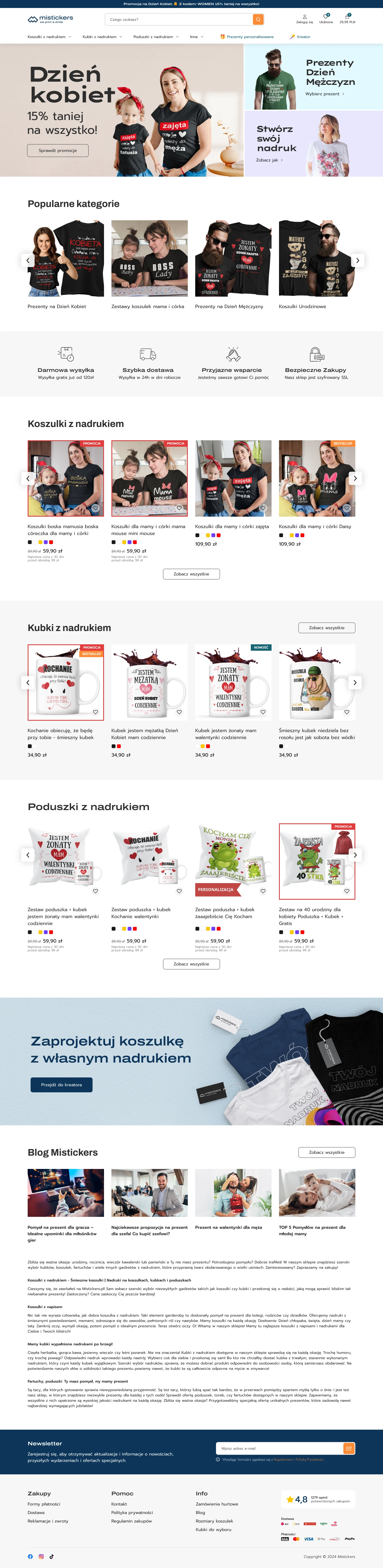
A full redesign — from logo through to checkout — built around removing friction and increasing average order value.
Logo & branding — refreshed visual identity that communicates a modern, playful brand without losing the personal-touch essence that custom products demand.
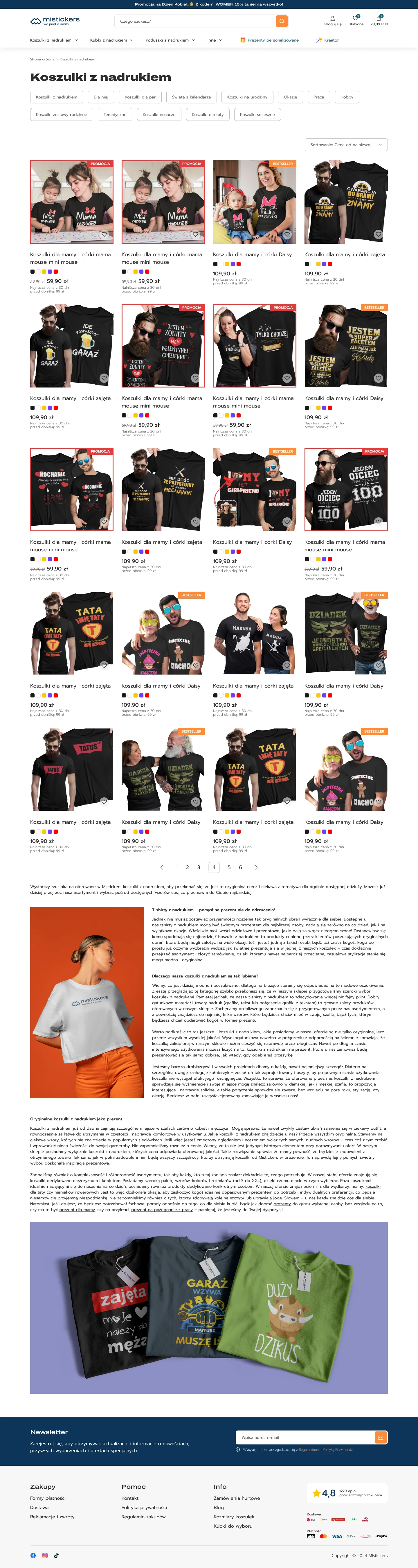
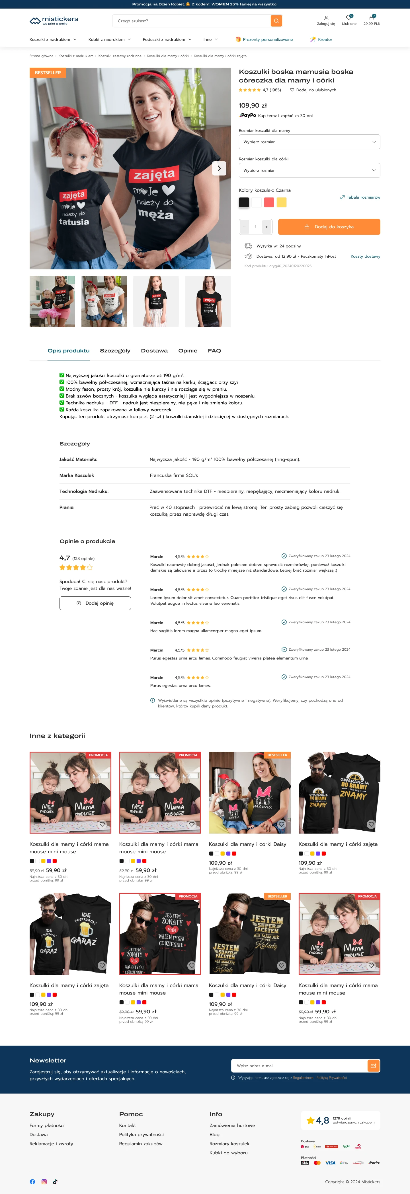
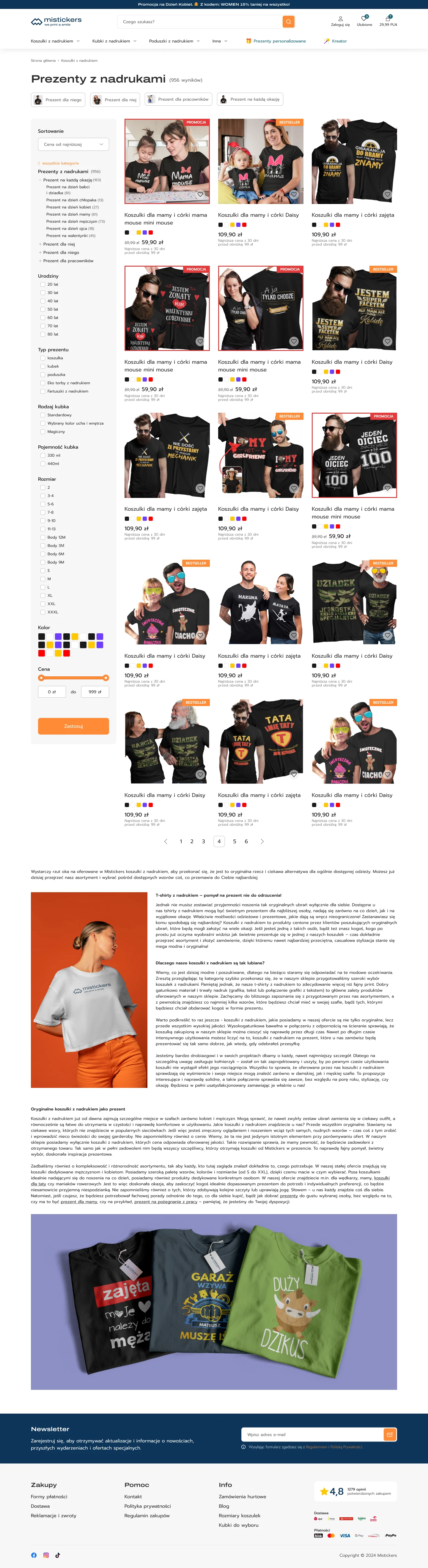
Simplified purchase flow — the entire UX was redesigned around one goal: get the customer from product selection through personalisation to checkout with as few steps as possible. No unnecessary screens, no confusing options.
- Product selection → personalisation → quick checkout
Clean UI design — clear layout, intuitive navigation, and product visuals front and centre. The merchandise is the hero — the interface gets out of the way.
Cross-selling & up-selling modules — smart product recommendations (e.g. t-shirt + mug set) and gift packaging options integrated naturally into the flow, not bolted on as afterthoughts.
Mobile-first — the entire experience prioritised for smartphone shopping, because that's where impulse purchases and gift browsing happen.
Process & Validation
- Figma — UX wireframes, interaction prototypes, full design system
- Adobe Illustrator / Photoshop — branding and product graphics
- Client workshops — analysed pain points and collaborated on the visual direction
- Prototype testing — usability validation of critical screens: cart, checkout, and personalisation flow — exactly where the old design was losing customers
Results
- +300% revenue increase after the new store launch
- Cart abandonment reduced — the simpler purchase process removes the friction that was costing sales
- Higher average order value — cross-selling and gift packaging turn single-item orders into multi-item ones
- Consistent, professional brand image — easier to remember, easier to recognise, and now competitive with the best in the category
This project was delivered on behalf of Webgravity.pl.
Project Images